
Background
Inspekto's mission is to free industrial factories and quality assurance (QA) workers from the exhausting, high cost, and time consuming manual testing process on production lines.
The Inspekto S70 system is an autonomous, sophisticated QA system for industrial parts, powered by Plug & Inspect® AI technology. The system is highly adaptable and is compatible with any production line. It is fully automated, and can be installed within a few minutes.
Target audience
Large factory owners. The systems are used by industrial plants in Europe, North America, and Asia and the actual users with Inspekto’s application are QA workers on the production lines.
The challenge
In case a defect in an industrial part manufactured on a production line goes unnoticed, it could potentially arrive to the customer as part of the finished product. This is a serious malfunction which could cause major implications, including profit loss, risk of lawsuits, and reputation damage. For some parts, this could also lead to loss of lives, which makes identifying the defects early crucial.


Key objective
Design a system which aids industrial factories detecting very early defects in their production lines. The system is AI powered, but is configured by humans, and as such the UX design in crucial.

Micro goals
I will describe in detail about the research and design process of two key features which meet the goal statement: 'Setup', and 'Profile Center'. These two features are related, as one leads to the other.
Setup: Allow creating a profile, which includes a machine learning quality control process. This feature's main objective is teaching the system what is a good part (OK) and what is a 'bad' part (NOK), so it can later tag parts automatically on the production line. This was an existing feature which had to be redesigned due to multiple UX and UI issues.
Profile Center: A profile optimization platform, which combines several tools for profile management, data display, statistics, performance tracking, settings, versions management, and more. The users can make decisions and receive recommendations on what they should improve, and what needs to change, in order for the system to perform better. This was a brand new feature which had to be designed from scratch.
Role: Product Designer
Responsibilities: UX research, specification, wireframes, prototyping, design, design system and style guide creation.
Step 1: Research 🔍

There are multiple effective methods for industrial environment user experience research (UXR). I will discuss 6 of them, which I used throughout my work: Secondary research, Competitive audit, Dogfooding, Qualitative research, Design thinking and Post launch research.
Secondary research
Secondary research denotes for research that uses 3rd party information. For example, using information from sources like literature, articles, or journals is considered secondary research. Another research category is based on the data type collected: qualitative vs quantitative (source: Google UX certificate).
I'll show an example for a secondary qualitative research of user experience in the industry environment domain.
According to Jonathan Walter: “A good HMI (human machine interface) design for a factory floor, focuses on the specific machine or process it’s monitoring and presents contextual information, not just data."
We can learn two major principals from the above:
1. a good HMI design is one which presents the user only the relevant information at each step in the process. It is unrecommended confusing the user with lots of information and irrelevant data.
2. Different roles have different needs, specifically factory workers have different needs than control room workers.
Below I'll show how I implemented these when I designed Inspketo's S70 user interface.
Industrial environment digital product design best practices
We should aim for displaying information visually accompanied with a concise text, as our brain interprets messages faster visually than textually. Despite this, we should not present the data too realistically, since it can cause a cognitive overload for the user.
Adding concise, short text, to summarize the visual functionality helps clarifying potential confusion and uncertainty about the interface meaning. Below is a list of best practices for a concise and effective user experience, and how I used them while designing the product:
1. Reduce unnecessary and irrelevant cognitive stimuli
avoid using un-utilitarian elements, excessive use of colors, or too much detail, which contribute to cognitive overload creation.
2. Take into consideration your users work conditions
In an industrial environment, users may wear gloves and eye protection while using the digital product. It is important to take this into account, when designing the product. For example: we'll make CTA buttons especially large, and use adequate spacing between them to avoid unintentional mistakes.

3. Allow multi - tasking
In an industrial environment it is common for one person (the user) to supervise 6 or more HMI displays simultaneously. Control room users need to be able to oversight several processes on a production line simultaneously. Therefore, It is imperative to present the information in a clean and hierarchical manner.
4. Use hierarchy
Use color proportionality to draw the user's attention to the most important things. Increase important buttons size, and reduce size of other, less important buttons. We should strive for a system where the user could tell apart the important from the unimportant with a quick glance.

Use heirarchy to draw user's attention to important parts.
From "Profile Center" feature design I made for Inspekto
5. Prevent "eye fatigue"
Control room workers do not change frequently and work long shifts (Usually 8-12 hours each). It is very likely the digital product user will suffer from eye fatigue at some point.
One solution to this is using greyscale colors, which are less demanding for human eyes.
The challenge is to find the right balance between creating good color contrast, but not to exaggerate and tire the user's eyes.
For example, the trendy Dark Mode is less recommended In this case, and may be less pleasant for users to read information.
Use Gray and light blue which are pleasant and calming colors for the eyes for a long time. From the "Profile Center" feature advanced design
6. Use colors where it matters
Do not use dominant color in a comprehensive and excessive way. Use it in CTA buttons, in parts that require special attention from the user, and in error / warning / danger situations.
7. Create a uniform design language
Use the same font across the product views, use a similar font weights, reuse the dominant color across all flows, reuse the data hierarchy.
Using a clear division: usually it is not recommended to use too much "boxes" and clear boundaries in design, but in industrial field it actually helps to avoid cognitive overload.
8. Use progress bars
In onboarding and setup processes you should clearly and unambiguously describe all steps necessary to complete and execute the full flow.
You should help users visually imagine what they need to do in order to complete the process. An interface that has a progress bar creates a sense of calmness and control among users over the entire process (e.g. "just a little more effort and I'm done").

An example of using a progress bar, from the "Setup" feature design I made for Inspekto,
9. Allow easy mistakes recovery
Mistakes happen. Sometimes a user completes a step and regrets it, or wants to go back and change something he did earlier. It is recommended to enable easy and convenient access for the user to go back, and fix early decisions.
10. Use a consistent positioning for elements and CTA buttons
Place "Next" and "Back" buttons in fixed locations, and do not make the user search for them on each step. In addition, the 'next' button is usually on the right while the 'back' button is on the left, since users are used to this formation and changing this might disorient them.

From the "Setup" feature, back and next are on fixed locations
11. Don't send the user out of the main flow
Use inline explanations and descriptions rather than external links, which will send the user out of the main flow. Make effort to keep the user focused on the main flow and offer inline help / descriptions.
12. Use short texts
Do not create cognitive overload by using long texts. Instead, use short, concise texts, only when required, to avoid user fatigue.
13. Provide immediate feedback
Anytime the user enters input, provide immediate feedback if their input is valid, so they can fix it immediately if needed. Do not wait with input verification to the last minute, or you will find yourself with a frustrated user, trying to understand what went wrong.

an error message providing immediate feedback
for the user's input, from the "Setup" feature
14. Do not overlook cultural differences
When designing a product for a particular target audience, one must first understand the culture of the target audience, their values, symbols and interpretations. For example, in Western culture red color symbolise warning, error, irregularity, or danger. In contrast, in asian cultures, the Red color symbolizes happiness, abundance and good luck.
So when designing, our audience culture matters. Inspekto has a lot of Chinese customers, and it is part the reason why the brand color is red.
Competitive audit
You can learn a lot from competitive audit. What are the advantages of your product over other competitors? and what are theirs over yours?
Are there any key differences we can learn from?
Comparing to other similar products can offer great insight, and contribute to a better final product design.
From my audit, I found multiple advantages of Inspekto's product over the competition:
- Inspekto's S70 is very fast to install and operate. Since it uses artificial intelligence to learn the parts, the integration process is super quick. Adding this to an easy integration offers a very fast to install product.
- Design and user experience in Inspekto is done by professionals ( including me :) ): Inspekto puts great emphasis on design, and a comfortable user experience, compared to the competitors. The competitors work mainly in the “Taylor made” method, which tries to create a specific system per customer, without investing in user interface or experience. The system creators are more on the technical side rather than design one.
- Price - Inspekto's system is far less expensive then the competitors, partially since it is developed once and fits all customers.
In addition, I also discovered some of the Advantages of Inspekto's competitors:
- The tailor-made approach competitors use to modify their product interface to specific customer needs, allows them a certain advantage, since each customer has its own unique product tailored exactly to their needs. In contrary, Inspekto's system attempts to support any type of customer, so it may lack some specific needs of potential customers.
- Reputation: some of Inspekto's competitors have a well-known brand, and a proven reputation in the AI solutions for the Industry. Their brands have been around for a long time, and they have gained loyal customers, who believe in them. Since Inspekto is a relatively new company, which has not yet sufficiently established its position in the global market, they have the burden of proof to show that the product and service they provide is better than any legacy product.
Dogfooding
The term "dogfooding" is an initial IT slang that traced back to Microsoft manager Paul Maritz, who, in 1988, used it to challenge Microsoft's internal employees to use the company's products. For IT professionals, the phrase "eating your own dog food" means using internal products on early stages of the product. The benefit of dogfooding, is that it offers developers and product designers a chance to solve product-related problems before releasing the product to consumers.
Since Inspekto's is a B2B company, there were times when it was not possible to survey users about certain features. Instead, I conducted user research with Inspekto's employees in several positions: Field Engineers, Managers, Marketing, Data Engineers, Support workers, Tech Solution workers, Software Engineers and QA Engineers. The feedback I gathered from the research, helped me making decisions regarding the product.
In addition to open ended questions, similarly to qualitative method, I frequently presented to each interviewee multiple design ideas for the same feature, and asked them to choose which is a better solution. In addition, I asked for reasoning for their chosen design.
This method provided valuable feedback, since it is a feedback provided by those who are very close to the product, who use it frequently, and are in frequent contact with Inspekto's real users.
Qualitative research
I Led the data collection and analysis, conducted the research on more than fourteen users. Mostly via Inspekto’s field application engineers. By interviewing the actual users of the product, I could find valuable insights on how they use the application, what works for them, and what could be improved.
Some of the questions we asked them:
- What is your biggest challenge when it comes to quality control?
- Are you satisfied with Inspekto’s app? why?
- What can be improved?
- Is there anything that frustrates you in the app? If so, what?
- Is there anything you would like us to add to the app?
We used their valuable feedback, and made effort to accommodate the product to their needs. listening to your users is crucial when designing user experience, since you get real users view and understand pain points.
In addition, we established good relationship with our users, which allowed them to approach to us on their own initiative, and ask for specific features they were missing, or complaint about existing features which required changes.
After every feature or change that was delivered to the users, I asked for feedback on the recent changes. This feedback cycle was very effective for developing an accurate UX which accommodates the user needs.
User story: As a QA worker, I want to have the ability to easily determine which part is OK or not OK (with one or more defects). So that I can do my tasks quickly and easily without needing help from customer service.

Design thinking
Some of the features that were considered large scale ones, were designed and specified by an extended UX team. On the extended team, we created a process where we planned and thought together on the system features look and feel. We put together a team that included senior executives, the CEO, the development manager, the technology manager, the data team manager, senior programmers, a UX consultant and myself.
Together, we did the following:
- Defined the product audience personas
- Created the user story
- Used the "How might we" method by exploring a bunch of ideas.
- Defined specific goals
- Crafted joint sketches
- Discussed each topic in detail
- Set priorities between features
- Decided on features to include and remove
The process lead to common macro decisions regarding feature specification, following micro decision regarding specific feature related issues. It provided a baseline for specifying the feature UX, and designing its UI on a later stage.
Design thinking method is consists of 5 steps:
- Understand
- Ideate
- Decide
- Prototype
- Test
Unfortunately, due to business and timelines considerations, it was decided not to do step #5 - test the product on real users. Instead, it was decided to test it on company employees (field engineers), who are in close contact with the customers / users. This decision required us to use another research method, the "Post launch" research:
Post launch research
a post launch research is done after the design is complete and your product has already launched. Within the product development life cycle, post launch research happens after the launch stage, to help validate that the product is meeting user needs through established metrics. In this method, the goal is to answer the question: Did we succeed?
This method will show you how your final product is performing based on established metrics, such as: adoption rate, user engagement, user satisfaction, and more.

Photo by UX Indonesia on Unsplash
Step 2: Inspirations 💫

I searched for inspirations on all kinds of UX & UI sites, Dribbble, Muesli, Medium, Google, Youtube videos interface, Slack videos interface, Instagram's multiple images & individual images displays. Additionally, I took inspiration from looking at the design of Adobe software for designers, the design program 'Sketch', and more.
Dashboards inspirations for "Profile Center" feature from medium articles (source links at the end of this article):
Dashboard Exploration by Moinul Ahsan.

Elegant UI kit — Dashboard by George Vasyagin for Awesomed

Aito — Employee Managment System by Johny vino™
Videos interfaces inspiration for the "Setup" feature:
Step 3: Ideate💡

During the work on the Setup flow feature, I iterated multiple concepts to try and complete the flows objectives (I used the "How might we" method). Below I'll show the product design evolution, as each iteration moved me closer to an optimal solution.
Concept #1: rejected
Three dedicated screens, one for each step in the setup process.
When the user completed a step, it clicks the 'Next' button, and the next screen in the flow shows.
I went with 3 steps only, in order to simplify the flow, and create a feeling where not much effort is needed to complete the flow, which should motivate users to complete it.
The 3 steps are as follows:
- Optical zoom selection.
- Marking: In this screen the user marks the part, excludes areas which doesn't need to be checked, and marks defective areas.
- Add more: in this screen the suer can add more samples of the part.once done, a success message is shown to indicate the process completion.

Rejected
Although this flow is relatively short, it lacks at another aspect, as it creates great cognitive overload, especially in step 2, the "marking" step.
Since all marking sub-tasks are performed in a single step in the flow, this may be overwhelming to the user and leave him frustrated or confused.
Should the user mark defects? or exclude areas for inspection? which one comes first? etc. There is just too much to do in this stage which completely misses the point of a controlled flow.
Another issue which bothered me, is that some of the subtasks in step 2 has similar attributes, and it felt like they could share the same interface, without interfering with the other sub tasks in this stage.
Concept #2: rejected
The next concept I considered contained one long screen with a scroll indicator, divided into 5 stages, with a progress bar that is pinned next to the navigation bar.
This time, 5 steps are introduced:
- Set optical zoom selection
- Mark the part
- Mark defect areas
- Exclude areas that are not relevant for inspection
- Add samples

Rejected
This concept is a bit old-fashioned design style, and creates a feeling of one long and tedious form. The Progress bar does not look good as it is adjacent to the navigation bar. I can do better than that 🙂
Concept #3: rejected
This time we'll have 5 steps in the setup process. When the user completed a step, they click 'Next', and the next screen in line appears.
5 steps is still a small step count, so it does not demotivate the user, but it allows us better separation of the different tasks need in order to complete the flow.
In addition, I used Inspekto's brand color for the CTA buttons and other important elements. Using Inspekto's brand color allows to emphasizes the connection to Inspekto's brand, and keep the design language consistent.
Steps:
- Set optical zoom selection
- Mark the part
- Mark defect areas
- Exclude areas that are not relevant for inspection
- Add good samples + success message

Rejected
Although the use of Red color in multiple elements looked like a good idea due to Inspekto's brand relation, it turned out not ideal.
Red is often used for alerting the user from a potential error or mistake. Using it too widely can easily confuse the user, and distract it from important messages he should be able to see. We could change the color of warning messages, but it will lead to more user confusion, since they are used to Red, and any other color use will feel odd.
Concept #4: accepted! ✅
Sequential model: a website structure that leads a user through a step-by-step process. This concept has 6 steps in the setup process, which offers a little more granularity and deep diving in each step.
In this concept, I used blue (#5079ff) as the main dominant color for elements needed emphasizing.
Despite the problematic nature of using the color red, it was important to me to use the brand color red, such as in the marketing materials. The use of brand colors creates a psychological connection, evokes emotion, association, and lowers cognitive load, in an attempt to guess what this product is and which company it belongs to. Every company's goal is to identify particular colors and style with their brand.
I had to use red wisely, since using red instinctively communicates danger, something is not OK, or an error. Red is very dominant by nature, so it was important to use it adequately and not overuse it.
In order to resolve this conflict, I used a gradient that combines orange and red for CTA buttons such as "Next" and "Back" buttons. Using a gradient that combines both red and orange colors helped differentiating between 'error' red, and 'emphasize' red.
Steps in this concept:
- Fill in details about the inspection station, profile name, and more.
- Position the sensor above the part being tested
- Determine the optical zoom, which affects the defects size.
The bigger the zoom, the more defects will be found (some may be untrue defects). The smaller the zoom, the fewer defects will be found. - Marking the contours of the part, excluding areas that are not part of the object (for example, a coil with a hole), marking the desired test areas and excluding areas that the user does not want to be examined.
* Includes a sub-step where the users are not required to do anything other than wait for the system to optimize the photo quality of the industrial part image.
- Marking refinement - in case the markings from the optimization sub-step
have moved slightly as a result of the optimization of the sensor. - Add good samples of parts in order to teach the system what is considered a normal part, and what is significantly different, and will be identified as a defective part with defect / defects.

Information architecture
When I started the process of redesigning the set-up process, the feature "Profile Center" did not exist. In addition, the onboarding process was very basic, and id not include any explanations.
Therefore it was decided to work simultaneously on redesigning the "Setup" process, while creating a new feature: "Profile center", which will allow users to have a home screen with all the important information, statistics and performance of existing profiles.
Additionally, "Profile Center" contains access to create a new profile which called the "Setup" process where the user teaches the AI to detect defects, in a way that is tailored to a specific industrial part.
The goal is to make the user not feel trapped within the "Setup" process. Therefore, at each step it was planned there would be direct access to the exit to the Profile Center, and saving of what they have done so far. In addition, it was planned that at any step, the user could go back to the previous step and fix things if needed.
In the final step, used to add good samples, users will return to the "Profile Center" where they will see initial performance, initial information, and recommendations for improving the profile they just created.

Step 4: Wireframes ✏️

I started with wireframes for the flow, to present multiple ideas and possible solutions. This allowed me comparing the possible solutions visually and see what works best.


Step 5: Design 🖌

Setup - before
Main problems: The interface is not user friendly, not easy to use, lack of demonstrations, users find it difficult to be independent and not be assisted by the Inspekto's Field Engineers.

Setup - initial design
The design process evolved gradually. New directions and refinements where introduced in multiple iterations along the process.


Setup - after
After multiple iterations along the process, we ended up with an improved, user friendly new design. The new setup screen incorporates the progress bar concept chosen in the ideation step, and facilitates many of the UX concepts I presented on the research step.

Inspketo new design overview
HI-FI prototype of the Setup process demonstrates how the user trains the AI system to detect defects. The flow begins with a step of filling in details, then a step of placing the sensor above the production line.
The third step in the Setup process is "Set detection sensitivity", which is used to adjust the sensor's sensitivity. This is a critical step for detection, due to users' tendency to adjust it to the maximum. This usually leads to the sensor may report irrelevant issues as defective parts (false positive).

The fourth step on the Setup process, the user is asked to mark the part he wants the system to train on.

The fourth step on the Setup process, the blue background at the top left stands for active and editable layer

The sixth step on the Setup process, the user is asked to add examples of good samples in order to train the system how to detect anomalies that will be detected as defects.
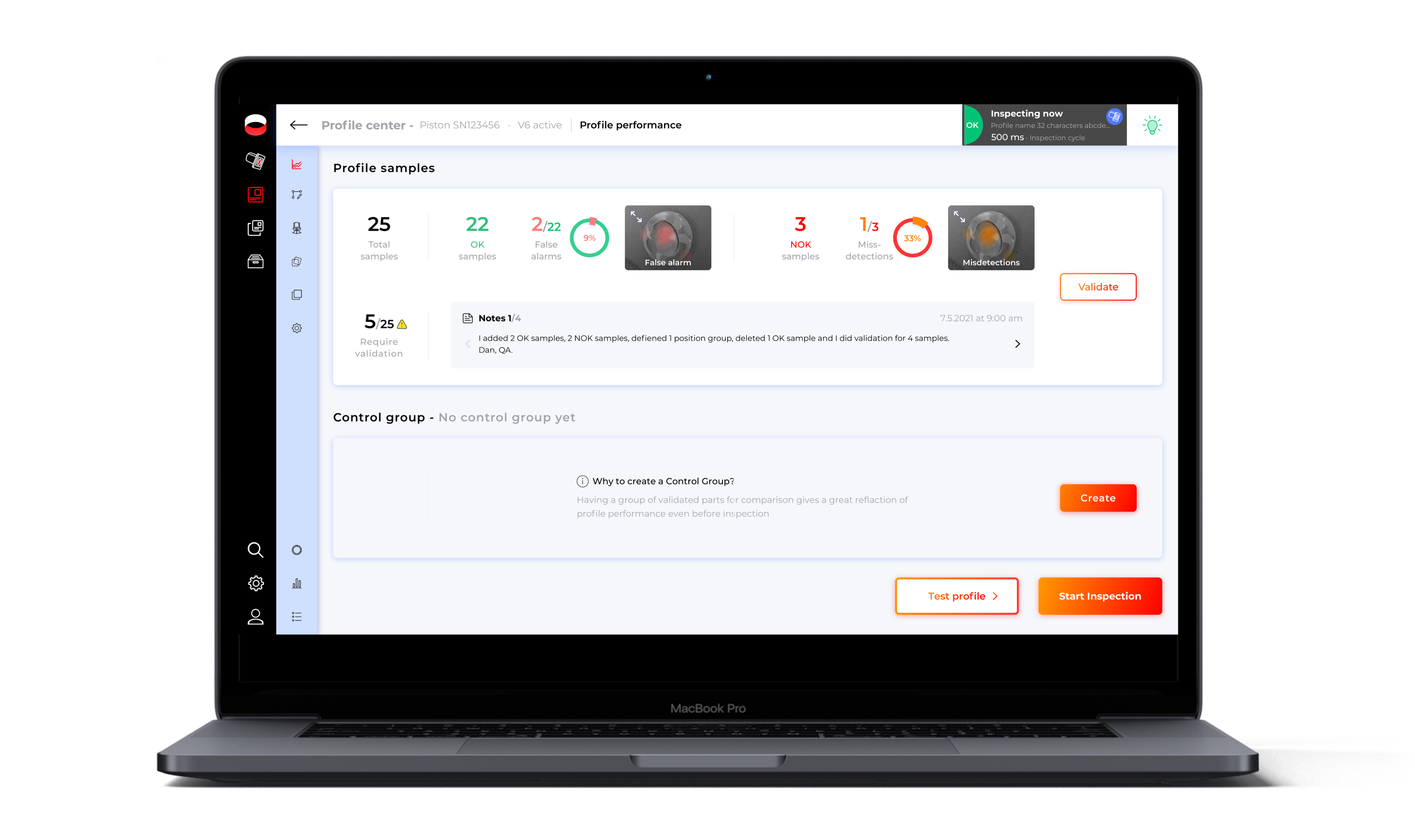
Profile Center - new feature

Profile center - overview

After the users finish building a profile (the setup process), they are directed to the profile center. This is one of the design options for the Profile Center feature with the default screen tab: Profile Performance tab, which presents information, performance and suggestions for improving the profile.

Profile Center - performance tab

From the "Profile Center" feature design. This is a heat map that shows users the locations where the artificial intelligence system alerted a defect that eventually turned out to be a false alarm and that the parts were OK. Users can use this heat map to detect the problematic areas, fix them, and improve the defect alerts.

When the user changes something in the profile, the system shows the impact of the changes: whether they improved / damaged the profile performance. The user can compare the results, and decide: either save the changes and apply to the existing profile, save as a draft for later use, or discard the changes completely.

This is an example of an enlarged heat map that shows the user the defects that the system accidentally missed, and the user manually identified.

Samples feature tab: an interactive view of the samples added by the user.

Suggestions for improvement, from the profile performance tab

Position Group feature tab: In order for the AI system to know how to identify an OK, it divides the samples to positions groups.

Markup tab: allows users to change the marking of the part on top of any samples added so far
Design choices inspired by Jonathan Walter's recommendations:
1. Grey colors: less demanding to user eyes over a long period of time.
2. Brand's dominant color: Inspekto's Red brand color, which was used for the CTA buttons and other important elements.
3. Progress bar: gives the user an indication of the steps count which they have to go through. The progress bar gives the user an overview of the flow, and offers a brief explanation of what will be asked of them at each step, which contributes to a sense of control and reduce user anxiety.
4. Next and Back buttons: allow the user to go back and correct mistakes in previous steps. The buttons are located in fixed places to prevent disorientation.
5. Visuals alongside concise textuality: it is important to display information visually like icons and buttons, along with brief textual explanations. It helps preventing user confusion, and maintains a clear interface.
6. Immediate feedback: provide immediate feedback in screens which the user performs actions with potential implications / prone to errors.
7. Uniform design language: use a uniform language to create conventions and a sense of familiarity.
Step 6: Style guide and design system 🎨


Progress bar steps for the Setup process


Marking tools for the "Mark part" step as part of the Setup feature.

Transitions.

Setup feature artboards flow
Takeaways
Inspekto's Setup and Profile Center features address two critical user needs, providing increased confidence in product quality, cost savings, performance management and the potential to save lives.
Regarding the Setup feature, the original interface's complexity led to a high volume of support requests. Consequently, the redesign focused on simplicity, incorporating shorter texts, informative demo clips, and user location cues to encourage continued progress. The success of this approach was evident in the increased number of users completing the setup process independently, faster learning curves, and positive feedback praising the simplicity and usefulness of the new interface.
However, some users expressed the need for more time to adapt to the new version, while acknowledging its improved aesthetics. The long-term success of the revamped Setup feature will be measured by the continued independence of a majority of users. Recognizing the potential for improvement, all feedback on the new interface is being gathered for implementation in future iterations.
Based on research and user feedback, it is evident that users can become accustomed to a suboptimal user experience without actively seeking improvement. However, when presented with a more user-friendly alternative, they readily appreciate the enhanced experience and recognize its potential for greater ease of use.
Regarding the Profile Center feature, initial reviews are favorable, but the possibility of initial enthusiasm for a completely new feature with many action options should be considered, as potential usability issues may emerge later. Usability testing and AB testing can play a crucial role in determining the true user-friendliness of the feature. While the positive initial feedback is encouraging, the implementation of AB testing in the future would save planning time and provide more accurate insights into user needs.
It is important to remember that even if users are satisfied with a particular feature and perceive its user experience as positive, there is always room for improvement.
Sources
UX:
- UX for the Industrial Environment, Part 1
- UX for the Industrial Environment, Part 2
- UX for the Industrial Environment, Part 3
Inspirations for dashboards from medium articles:
- 10 Rules of Dashboard Design
- Dashboards Inspiration 2017
